Sunday, 10 February 2013

film shoot day - performance shots


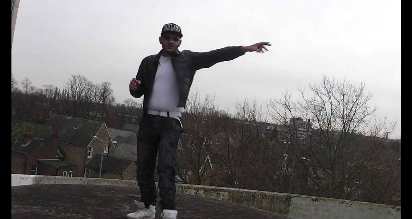
On this film shoot day we went to the roof of a car park to film. This choice of location is driven by the idea that we are implying that these artists have come a long way and our now doing well for themselves. In this shot the artists stand back to back to build chemistry between them; even though the performance shots aren't as emotive as the storyline if these 2 artists appear to have a general friendship it becomes more believable to the viewer which will allow them to enjoy the video without there being any tension or unease between the artists.


The physical expressions of the artists and the quality of there performance is vital in the success or effectiveness of the video. Here the artist looks and points into the camera; this display of direct address is what will gain the viewers attention and make them feel as if the artist are talking directly to them which will evoke emotion from the viewers as they become more involved.


This paticular shot is a miving shot where the camera is circling the two musicians in order to give a feel of their busy lifestyle and how they are constantly on the move but must continue to perform their best even whilst their lives are changing dramatically.

Saturday, 9 February 2013

shooting day - highstreet


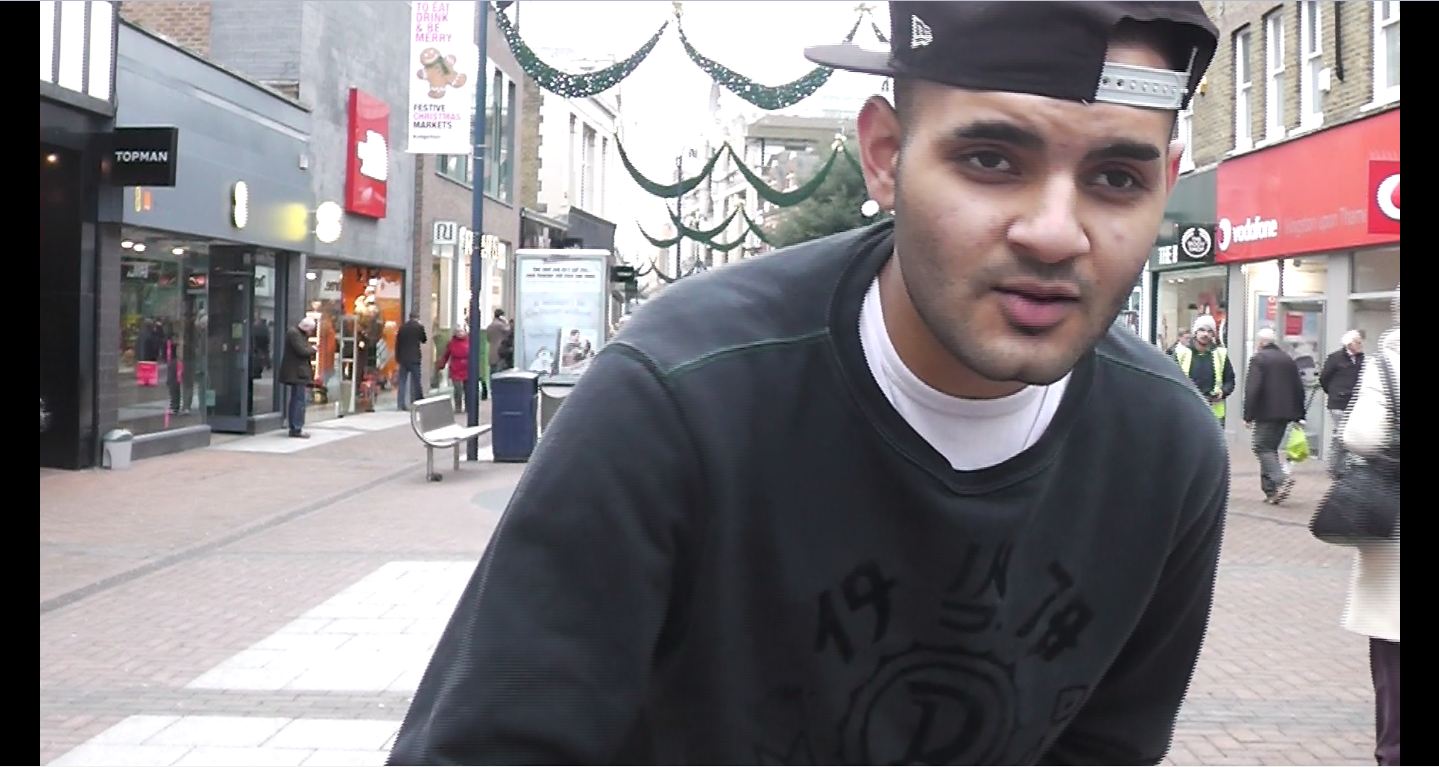
This high street shot above is also building the theme of the busy life they lead and the hustle and bustle of London which gives a contextual element as it sets the scene.


This shot is contrasted to the busy shot above; this is a contemplative shot as if the artist is in deep thought. We will need shots like this for cutaways to emphasise that this song does have a deeper meaning to it.


Friday, 8 February 2013

album art 3 - Digi pack analysis

This album cover here is sending a very strong message through the imagery. The title of the album and the graphics are strongly linked to sell the angle and star image of the artist. This artist is someone who has come from struggle and poverty to success and wealth and often speaks about the contrast between the 2 within his music. The tittle being dreams and nightmares is in line with this character.

The image on the cover is of hand cuffs but one of the cuffs is an expensive watch instead, this follows the concept of dreams and nightmares and is very clear in getting the meaning across. The graphics are very well detailed and manage to get the right balance between realism and animation.

The key being placed in the cuff is a symbol that he is now free from the shackles of his past life and has found the key to his freedom through his music

The font also follows the album theme having the dreams in clear white writing appearing bright and clean; then the nightmares is red and bloody with blood dripping below which also represents all the bleeding and violence he encountered in his previous walk of life. The word dreams is also in a bigger font than the nightmares to show that the positives in his life outweigh the negatives.

The background being black allows the audience to focus on the imagery and receive the message that is being shown to them; the gold watch and cuffs are made to stand out on the cover as this is key symbolism in the aim of getting to audience to understand the meaning and reasoning behind the album title.

album art 2 - Digi pack analysis

This album was this artists 1st album and so the art work is focused on establishing his name to the viewers hence the title 'i am chipmunk'. As you can see the size of the font is so much bigger than the image of the artist and so its clearly more important to them to emphasise his name rather than his face. The colours also play a part because the strong contrast in colours between the black and yellow make the words stand out even more. The light shining behind the words has connotations that there are good things to come.

Here they have a chance to show a bigger picture of the artist on the back cover
 once again showing the bright light behind him giving him a positive aura to balance the negative aggressive perceptions of his previous genre and his current stance.


album art 1


advertisement - above and below the line

Above the line promotion is carried out through mass media such as television, newspapers, radio, billboards and so on.

Below the line are things that often cost less money or no money at all, things such as interviews, exhibitions, public relations and things that build interest and desire but dont require expenditure.

Major label artist will often use abpve the line promotion or advertisement because their record label has the required revenue to fund these activities.

Thursday, 7 February 2013

film shoot day - story line

We filmed the majority of the story line section of our video on this shoot day. We started off with the classroom scene, we done a medium/long shot to show the majority of the classroom and therefore setting the scene before the main character walks in.

We decided to film everything from three different angles to give opportunity for effective continuity editing, and so we did this. We tried a creative shot of the main character reaching into his bag with the camera point of view being from within the bag looking up at the main character. We also did an over the shoulder shot of the female protagonist which highlighted the main characters interest in her.

We got upshots of the bully to establish that he is someone of higher authority and power than the main character who is being bullied. This characters role was selected as a tall person to make this point even easier to emphasize.